The Ugliest Color in the World…
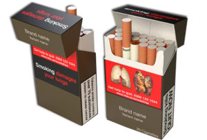
I heard something very interesting on the commute into work today. An Australian research agency, GfK Bluemoon, claims to have found what smokers consider the ugliest color in the world. It’s a brownish, greenish color, or more specifically Pantone 448C. The top associations, according to the survey, were “Dirty,” “Death,” and “Tar.” Ah ha! Got ya! This is now the new it-color for cigarette packages sold in Australia and in the UK. All packages will have this stripped down packaging.
It’s quite the unusual task: find a color that is the most unappealing and make this the number one choice for the packaging. Rather than tobacco companies using marketing to lure an interested customer, the government has stepped in as an effort to detour a citizen from making a potentially harmful decision.
At AFFIRM, we call this tactic Change Behavior Marketing. We’ve analyzed the barriers or motivations of change for many of our clients including the Department of Justice with our DOSE OF REALITY campaign to curb opioid abuse, Department of Transportation with our ZERO IN WISCONSIN program to encourage safe driving habits, and RECYCLE FOR GOOD to ramp up recycling throughout the City of Milwaukee, to name a few.
I digress, back to the ugliest color in the world. The Pantone Color Institute, on the other hand, felt that there is “no such thing” as an ugly color. Their take on the color was that PMS 448C was associated with “deep, rich earth tones” found in high fashion and popular in furniture and shoes.
All colors are beautiful in their own way, but when taking into account the particular audience and specific product, there is a strong case for leaning towards the negative associations. The bottom line – it looks like it’s paying off. Cigarette sales are down in Australia!


